Design Problem:
At the start of the pandemic my friends and I created a workout log to keep us motivated while being stuck at home. I started using STRAVA for running, but couldn’t find a workout app I liked to recored my exercises. So, this lead to my ultimate design problem.
How do we incorporate a more fleshed-out workout section in the STRAVA app?
User Interviews & Analysis
I interviewed 7 “active” people aging from 30-35 and got the following results
Affinity Mapping
Problems
Doesn’t want to “show off” to random people how much they might lift
Too much effort and forgets to input data
Feels nervous if trying a new exercise
From here I was able to make a persona that envisioned the user of who would use a workout tracking App.
Persona
Competitive Research
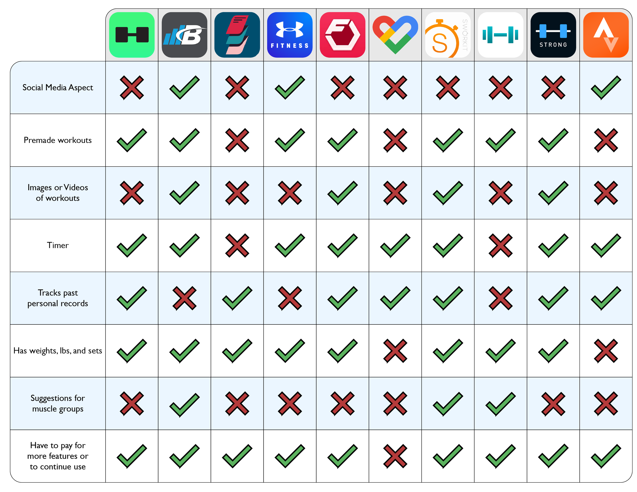
Based on the feedback from my interviews, I wanted look into the other apps people used as well as find other solutions. I looked at 10 apps all together to find what worked and didn’t work in each of them.
From here I made a competitive analysis chart to easily view the features that worked and didn’t work.
Seeing that the Strong App had most of the features I was looking for, I wanted to do a journey map to get a better understanding of what was needed and what could go.
Journey Map - Strong App
The Strong App has 24 screens when going from start to finish. Although it was very clear and purposeful, my goal was to slim down the Strava flow because it seemed too tedious to fill out every time you workout. I felt a more cohesive flow could work better.
Flow Chart
Wire Frames
First Draft of Prototypes
Feedback
I reviewed the first draft of the prototype with 5 people who typically use Strava or a similar app and received the following feedback:
Confusion once you hit the Start button and where to write in sets, reps, and lbs.
Possibly skipping selection of exercises and continuing with standard timing and heart rate.


